National Geographic Society
Redesigning a post-project quantitative form to understand the real-world impact of National Geographic's grant recipients to inform donors.
ROLE
UX Design Intern
TIMELINE
Summer 2025, 10 Weeks
TOOLS
Figma, Figma Make, Maze, Storybook
CONTEXT
National Geographic Society is a non-profit that supports “Explorers” — people working on sustainability and environmental projects in their community — through grants funded by donors.
THE PROBLEM
NatGeo needed a way to measure the impact they make to communicate with donors
Until recently, NGS lacked a clear way to measure impact, but the Strategic Insights team introduced a standardized metric form to begin collecting consistent data.


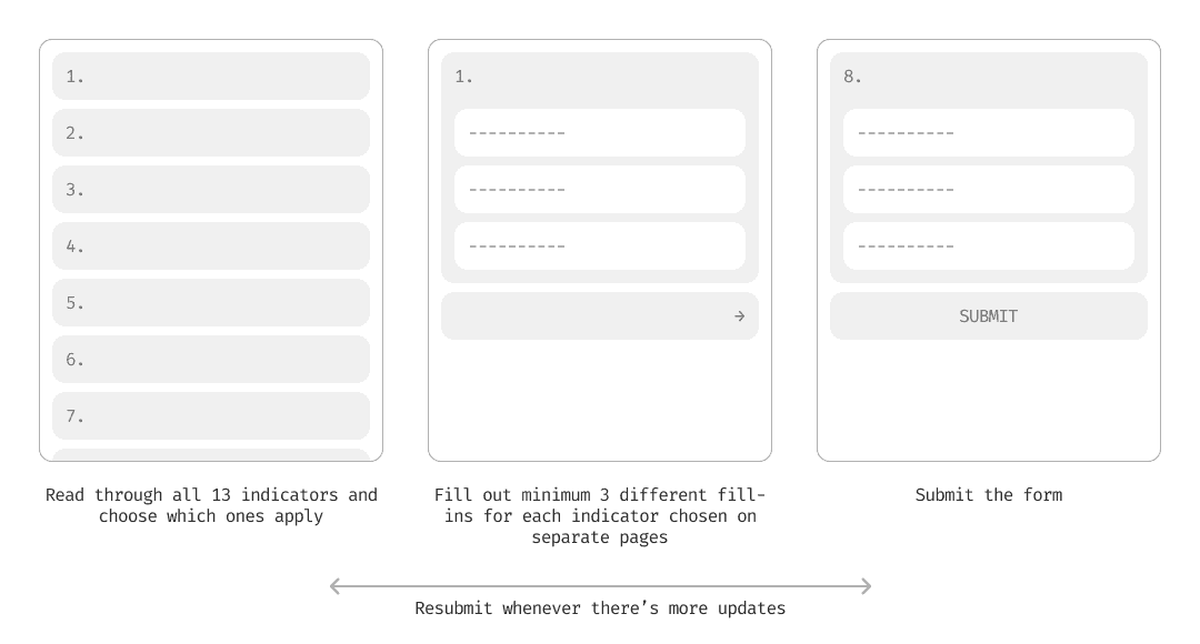
The form details are sensitive so this is a placeholder example form. But the post-project quantitative metric form includes 13 indicators (or metrics of measurement) of impact with at least 3 corresponding fill-ins for each.
Except, despite the form being mandatory, lots of Explorers weren’t filling it out
I can't show a photo of the form itself, but it was hosted on Salesforce. The interface was just open back-end with no proper flows, making it incredibly unintuitive.
The goal? Reimagine how Explorers report their project impact through the platform they already use, the Explorer Home

The internal NGS home for explorers! Contains a directory, resources for their grant, and more.
THE DELIVERABLES
Near-Term Prototype (to ship in a quarter)
Future Vision Concept (go wild!)
NOTE: Even for the near-term prototype, they told me to push the boundaries and not go for something fully feasible. This was an exploration into “what could be” to rally important stakeholders.
THE PROCESS
Is it just the form being ugly that was causing issues? No… The Explorer’s main complaints also clashed with what the business team needed
Beyond the complete mess of a form interface, Explorers also complained about the length, format, and process of reporting, but the business team couldn’t change the number of metrics or how often they needed it...
EXPLORER COMPLAINTS:
The form was too long with too much to fill out with 13 metric topics, each with multiple fill-ins.
Explorers insisted they couldn’t fill out the form until they had all of their data (studies take years to be published)
They felt it was repetitive and tedious to have to fill out the form multiple times.
BUSINESS TEAM NEEDS:
They needed all 13 metrics and needed long descriptions to describe each of them in very specific terms to capture the full impact of NatGeo in terms of their mission.
They needed whatever data was available as soon as possible to make an initial donor report to prove why this is needed and to observe grant progress over time.
They needed accurate, ongoing updates as new results emerged for donor reports and to identify patterns in grant progress.
SO, THE GOAL BECAME
Redesign the impact reporting experience so explorers feel supported—not burdened—when submitting incomplete or evolving data, while still giving the business team accurate and timely metrics that they depend on for donor reporting.
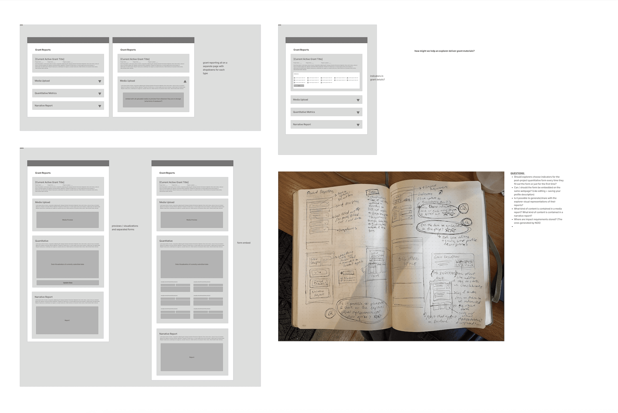
From there I started wireframing out potential interfaces and realized that the current form model was creating a lot of friction
The step-by-step wizard required long reading and constant page-switching, and any update meant repeating that entire process. A form was not suiting the active updates the business team needed.
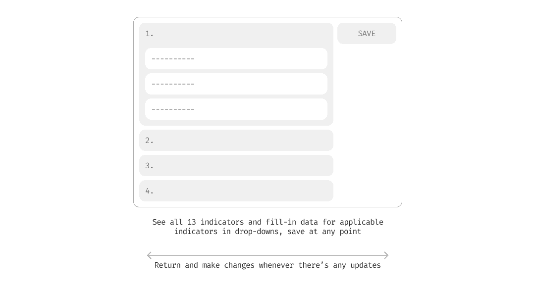
What if we changed this flow by using a different mental model, emulating something that is more of an active update, like a database?
By changing the model to fit the active update requirements of the form, we are eliminating that cognitive friction of submitting a form over and over again, and establishing timely updates as part of the model.
Note: This is an assumption. It was supported by secondary research but because of the tight timeline, couldn’t be tested with Explorers. If I had more time, I would use a cognitive walkthrough.
I made many wireframes and went through a lot of iterations to refine this idea and that eventually led me to my solution…
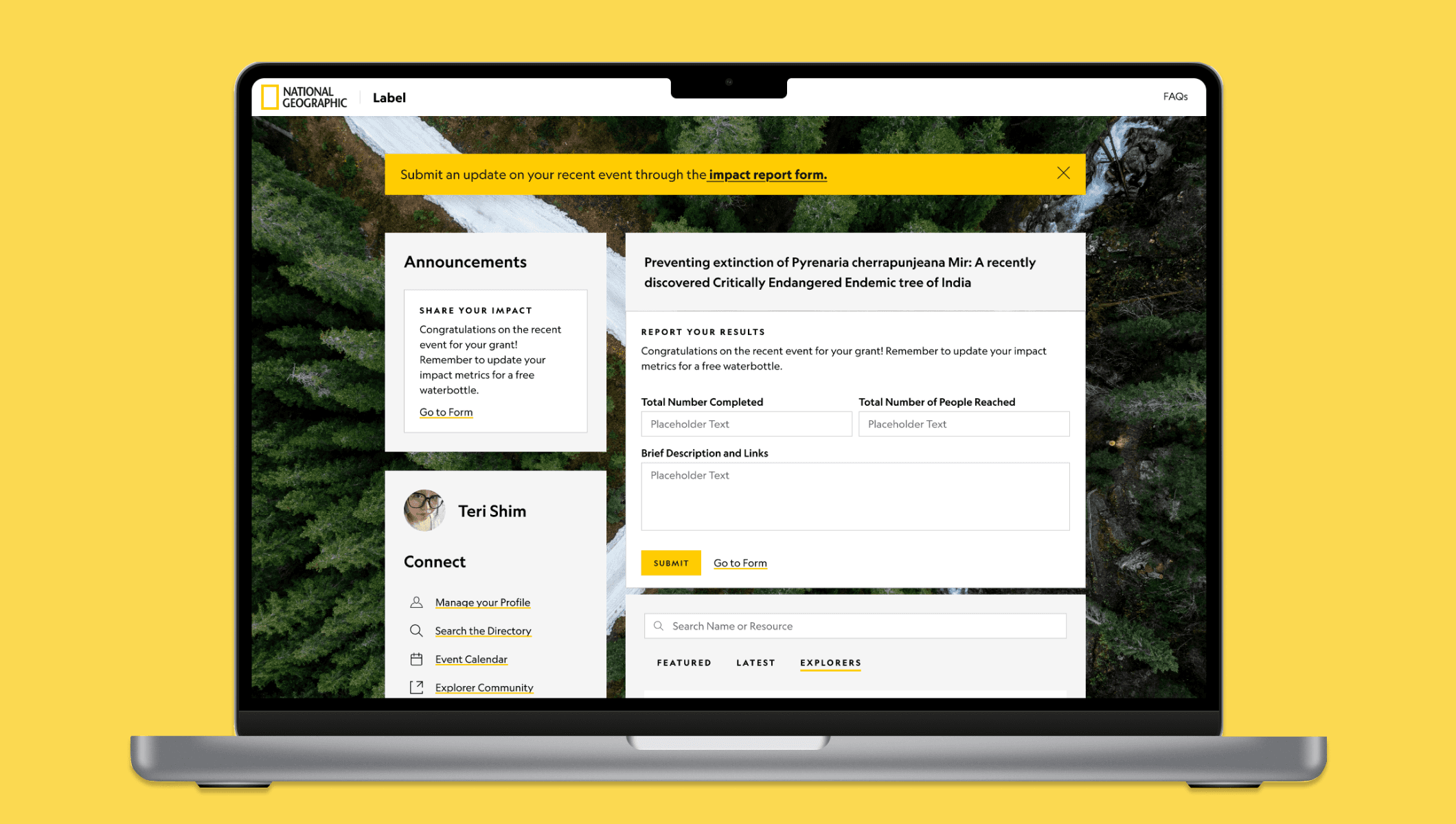
THE NEAR-TERM PROTOTYPE
Integrating reporting into ExHome as a page explorers can update at any time

01
Explorers share their impact directly through Explorer Home
Using the existing announcements box and alert system.

02
Salesforce integration lets Explorers view their specific grant details
Including the goals they set in their project description, and use them to choose indicators for more accurate results.
03
Explorers browse indicators, select what applies, and add data via dropdown
No need to click through multiple pages. All indicators can be viewed and updated on one page.

04
With in-line fill-out, Explorers can update specific metrics directly in Explorer Home
This allows the business team to target data collection more effectively, giving them multiple ways to capture the partial data they need.
05
When updating, Explorers only see the indicators they’ve already filled out
No need to go through all the others again. If they want to add a new one, they just click a button.
ITERATING WITH STAKEHOLDERS
Encouraging Explorers to share partial data so the business team can get timely insights
After presenting this solution to the SSI team lead, I learned their biggest challenge was timing: they needed data as soon as possible, but explorers often withheld submission until they had everything ready. Therefore, I designed this sticky bar to fulfill the business needs of SSI.
THE FUTURE VISION
Giving inherent value to updating your metrics by making them public-facing
Building on the community hub that the Explorer Home Designer and PM were working on, I imagined a potential future concept where explorers share impact data through the creation of a public grant webpage.
01
Each Explorer profile now includes a custom webpage with their grant information
Instead of a block of text, this gives Explorers a quick, concise way to share their grant details and connect with others who could support them.
02
With a website editor–style interface, Explorers can manage and add data to their webpage
Framed as a grant website they can use to connect with other Explorers, the design naturally motivates them to keep their data up to date for NGS.

03
Aligning design with business needs
The data blocks in the website editors include a dropdown that lets Explorers submit metrics tied directly to the specific indicators the business team needs.
04
Reducing brand pressure with AI support
Feedback from the Explorer Home designer and PM told me Explorers felt pressured by the NatGeo brand and worried their writing wasn’t good enough. To help the business team gather more narrative data, I integrated an AI tool to reassure them their writing met standards.
PRESENTING TO STAKEHOLDERS
I presented my solution to stakeholders including the business team, the director of PMs, the design manager, and other leadership. Hoping to inspire a future vision and explore the use of emerging tech in design ops
I walked through my full design process, my reasoning, and my usage of AI in the process and encouraged discussion of where the ExHome website could go, especially with its growing community features.
EXTRA TIDBITS
Some other details that didn’t make it into the case study...

Ran ideation session with stakeholders around the question “How can we collect impact metrics?” to gather varying perspectives

Created new local components for the design system

Used Figma Make to ideate interaction patterns
INTERVIEW OVERVIEW
Some other projects I worked on…
Designed and documented an internal AI tool to help non-technical writers build article webpages using design system components using Gemini prompt engineering, saving designers 5 hours per week.
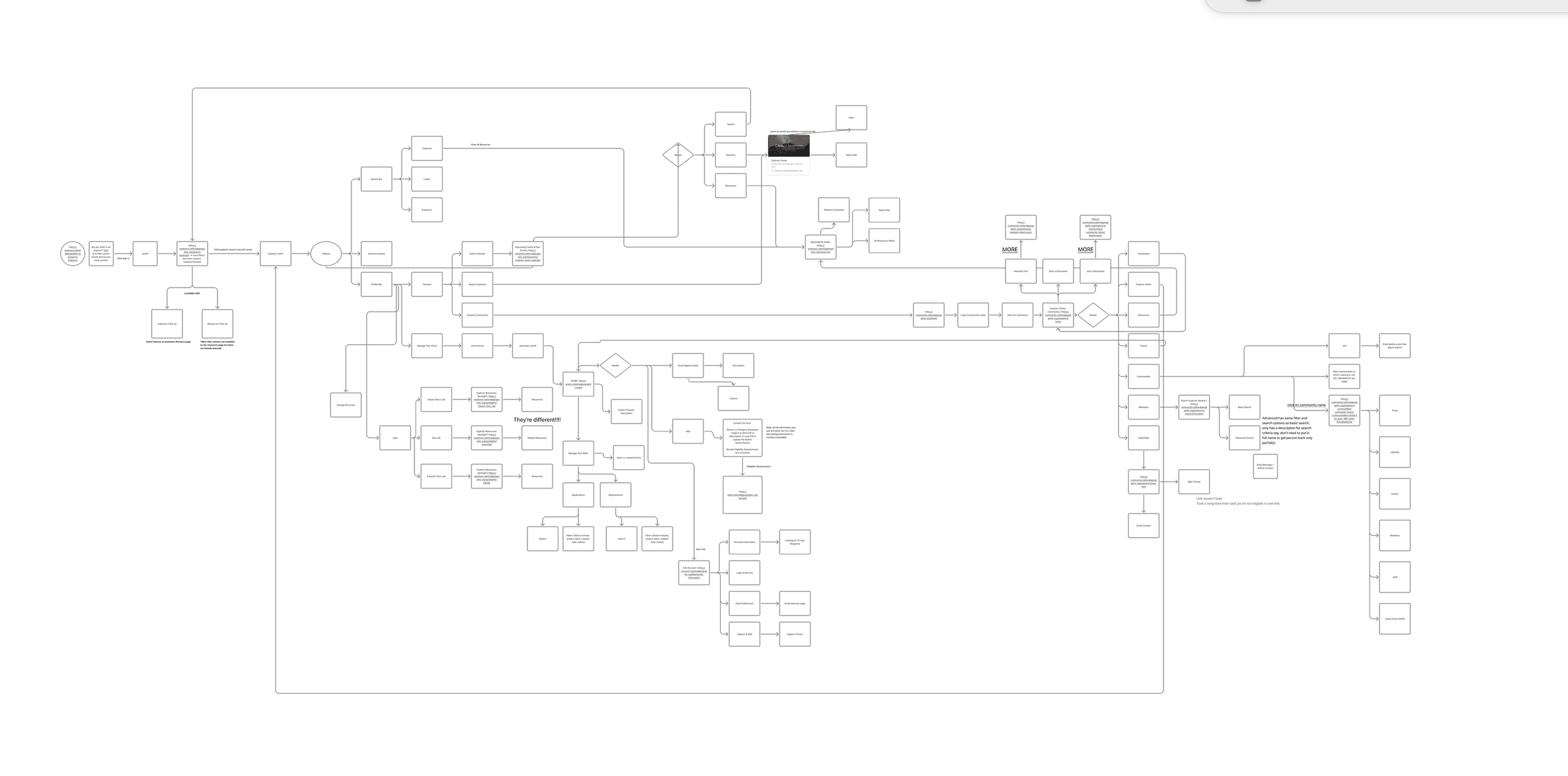
Modeled the information architecture of the NGS grant recipient internal website and proposed changes to clarify content.
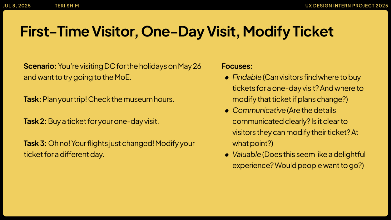
Ran unmoderated usability tests (Maze) to test how accessible, findable, communicative, and valuable trip details and ticket information on the new Museum website is for first-time, one-day visitors. 🗣️ Presented insights and recommendations to the design manager.
TAKEAWAYS
1.
Loop in stakeholders regularly to maintain confidence and buy-in for your designs
2.
Prototypes are incredibly effective in rallying stakeholders and pushing future visions
3.
Understand the needs and frustrations of ALL of your stakeholders to create a comprehensive solution (business, design, end-user, development, management etc.)