StoryScape
Two-Day Design Sprint and Later Revisions
StoryScape is a writing editor perfect for creatives with robust photo insert options alongside organized text documents.
BACKGROUND
This is a design sprint for the challenge of design a feature for a non-existing writing editor platform.
DURATION
Two-day sprint with later revisions, Fall 2024
SKILLS
Product-Thinking, Interface Design, Prototyping
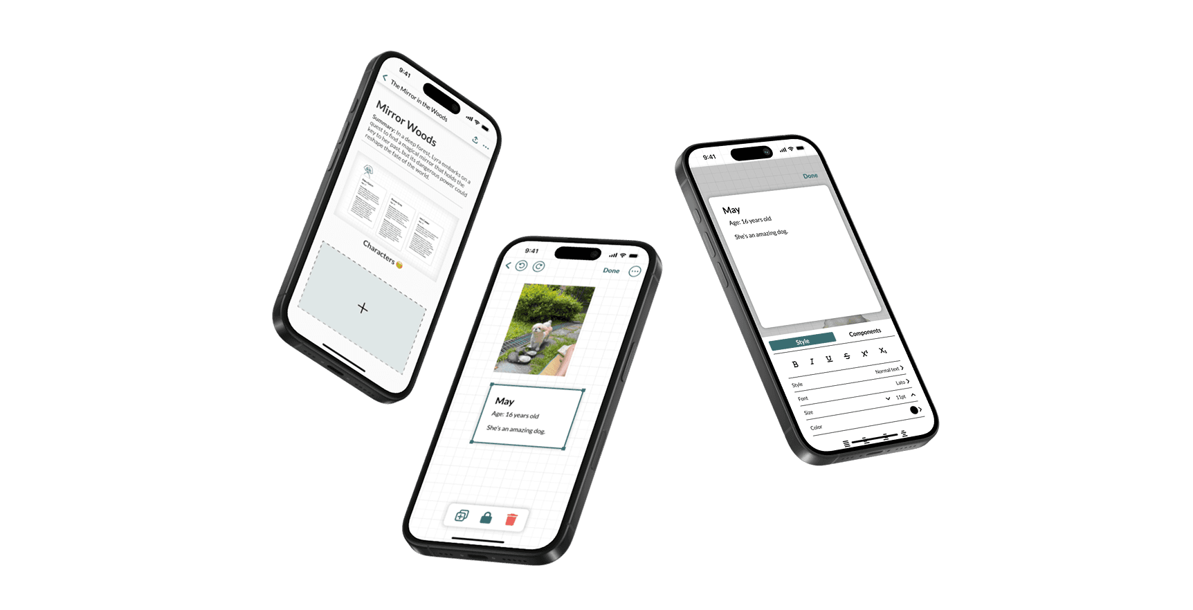
PROTOTYPE
The Lore World-Building Dream
RESEARCH
Writing Editors Help You Organize BIG Ideas
My first thought was:
What are writing editors?
So, I did some research:
Writing editors make big bodies of text look prettier (modular blocks like Notion).
Writing editors make it easier to find certain sections of information.
Writing editors make big groups of information easier to organize.
USER INTERVIEWS
But Adding Photos to Writing Editors is Annoying :(
Fanta, Author
“Whenever I add images to my world building documents, they always become lower quality. But I have to keep using [docs] because I have so much words.”
Dez, Game Artist
“I like to add images for my brainstorming but I can’t move them around the way I want to in Notion.”
Jolynn, Game Designer
“I want to be able to organize my boards however I want. I’m very picky.”
Creatives, especially those working on building large complex worlds, rely on writing editors to organize their complex ideas. But as creatives and visual thinkers, they want to be able to add images to their brainstorming, but adding images is difficult.
Images are low-quality and difficult to format if not impossible.
How might we design a writing editor that allows creatives to seamlessly organize large text blocks alongside images?
THE IDEA
An Editor For Creatives That Can Organize Your Words and Your Images
Text Blocks
Aa
Insert text blocks with styled writing, suitable for long paragraphs and short sentences.
Image Options
Insert and manipulate images, being able to put it wherever they want in the free space of the board.
Sketch
Use a sketch tool to draw out visuals or draw lines to make connections.
THE PROCESS
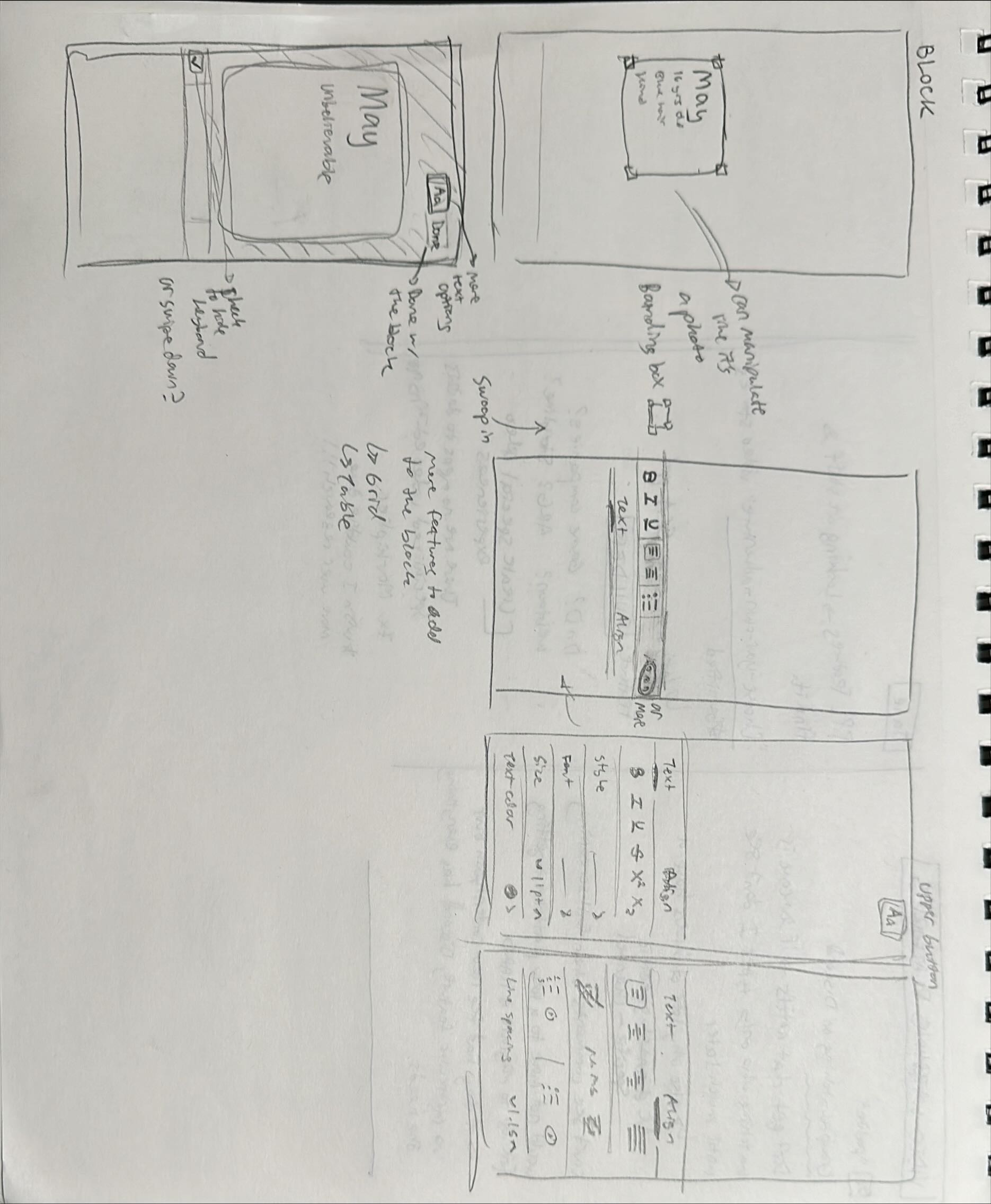
Iterating... Iterating...
I rapidly iterated on different layout and feature ideas. I focused on mapping out the user flow as well as exploring how my idea for the feature translated into an interface.


FEEDBACK AND ITERATION
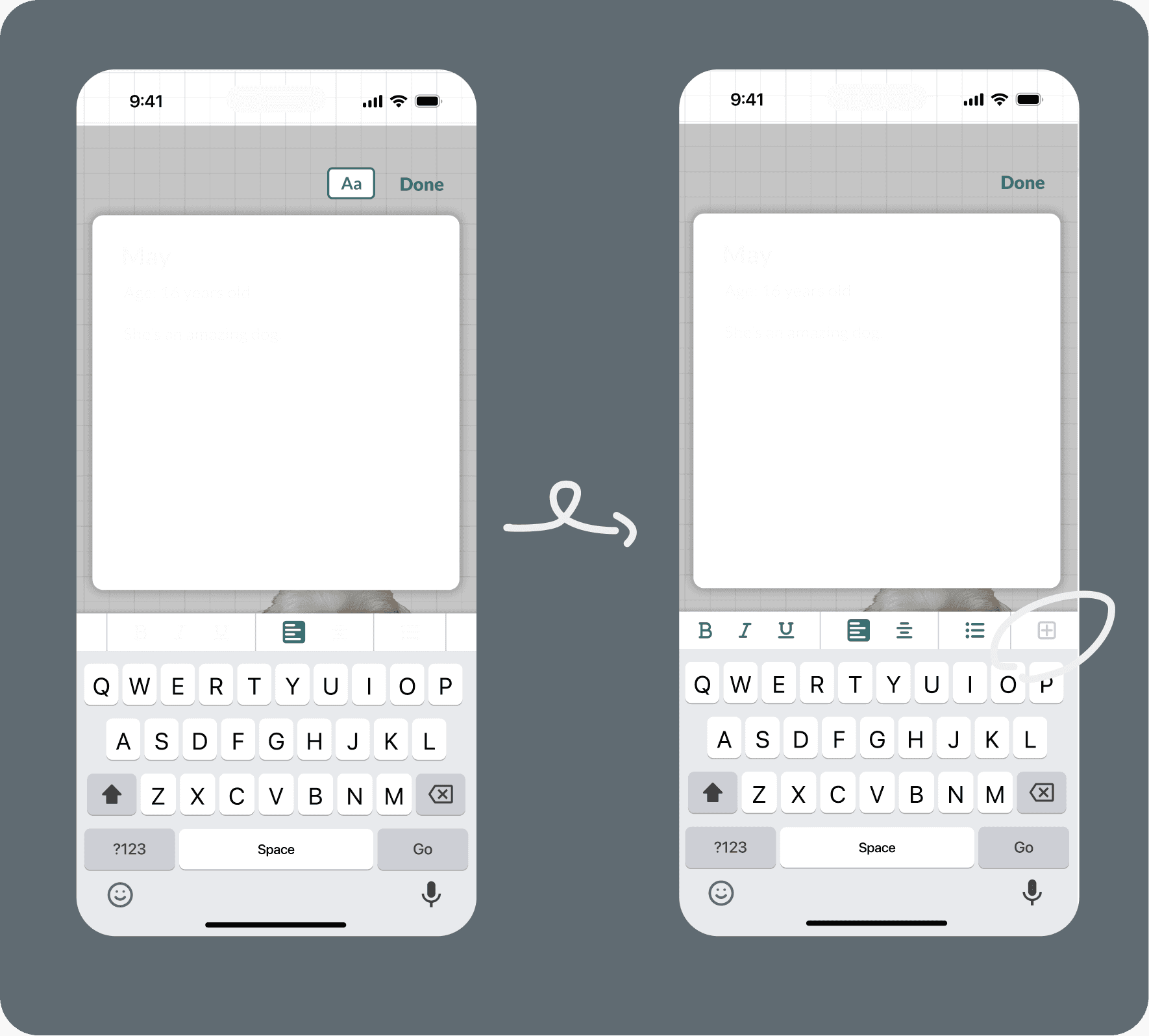
Now, let’s test it. Co-design interview!
I conducted a co-design interview with one of the users I interviewed before. She walked through the entire app and voiced out her entire process, allowing me to pinpoint specific confusing parts.
From that I received two main points of feedback:
The page types were hard to read and jarring.
So I moved the page type title to match other title treatments more as well as make it more legible with increased contrast.

The user could not find the extra styles button.
I changed the icon to indicate there was more to find and moved it to the quick-style bar to make it easier to group together and know what the “+” is for intuitively.
TAKEAWAYS
Listen Closely to the Users
Believe in User Research
At the start, while looking for a problem, I kept trying to come up with ideas. I asked about others about what they thought about my idea vs. actually pinpointing a problem. After realizing I was searching for a solution instead of a problem, I started asking more open-ended questions and just trying to find pain points and that yielded a much more well-supported idea and final feature. Little points like options to lock the images all came from my user interviews and that definitely helped refine the product.
Improvements
There are definitely still areas to improve. The design system isn’t very cohesive (different sized icons), the sketch tool isn’t fully built out, and the writing block components haven’t been designed. So, I leave this project open for a revisit.