Iron Testament
Interfaces for the robot apocalypse.
BACKGROUND
This is a continuing games project where I’m leading a team of 5 in developing interfaces for a tactical strategy game. The player takes on the role of the last human survivor in a solarpunk, post-apocalyptic world, leading a faction of human-worshipping robots against hostile robots determined to eliminate humanity’s final traces.
TIMELINE
Apr 2023 - Present
SKILLS
Design Systems (UI Kit)
Wire-framing
Prototyping
Communication
IN-PROGRESS PROTOTYPE
Robots! Mechas!
MOODBOARDING
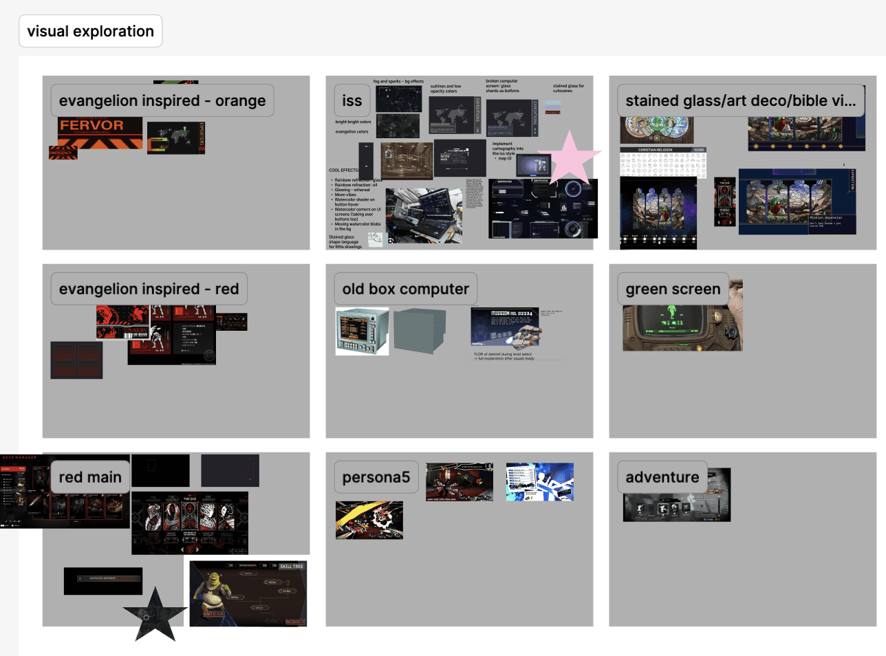
What is Iron Testament?
The setting of Iron Testament is the ISS hundreds of years after the robot apocalypse that erased nearly the entire human race. Keeping that in mind, I led our team alongside my co-lead through mood-boarding and we settled on the theme of...
Biblical Techno

WIREFRAMING
Iterating, Iterating, Iterating
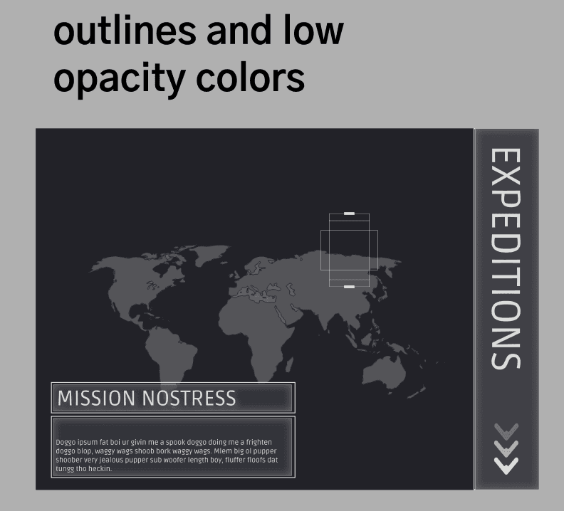
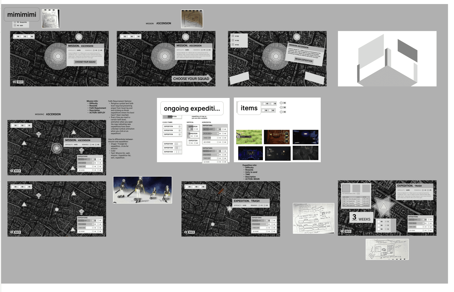
As the person with the most experience with UIUX, I led the team through the wire-framing process. After deciding the visual theme, we had an idea of what kind of shape language we might want to use as well as general layouts (ISS computer). I encouraged the team to focus on rapidly iterating through the low-fidelity sketches by assigning 10 for each screen. I wanted to encourage them to try different layouts and experiment with different ways to showcase all of the complex information.
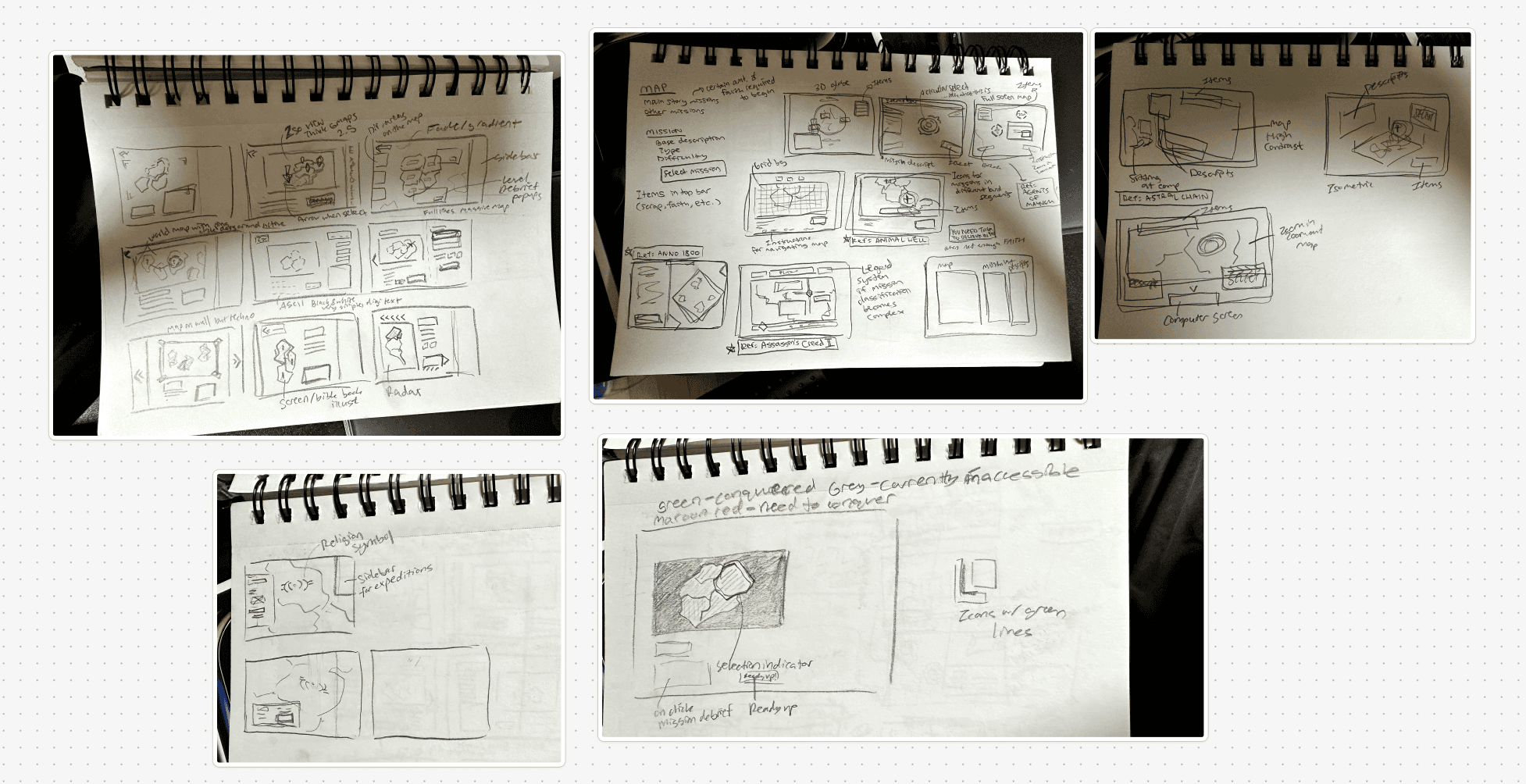
I worked on designing the missions center where players would:
Select a mission on a map
See what missions are unlocked/locked
See what missions were complete
Know what level they had to be to go on a mission
See the mission name and description
Choose a mission and move on to the squad ready up screen
Select expeditions to send extra robots on for extra materials
See what expeditions were currently going on
See what expeditions were available
See what materials they had and the rewards they would be getting
Choose robots to send on expeditions
See how long the expedition would take depending on what robots were chosen
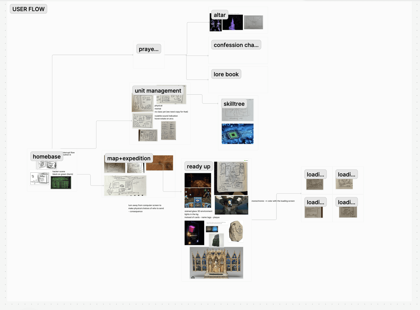
USER FLOW
Developing the User Flow
We had already worked on developing the user flow a bit as an entire team (working cross-functionally across design, art, and development) but I solidified it as UIUX lead after designing the low-fidelities and pulling our favorite sketches for each screen.
TESTING
Visual Concepts
Next, me and my co-lead worked on developing some potential visual concepts to guide the shape language and font choice for our mid-fidelities as well as guide our discussions on the visual design with the art team. I recreated game screens as well as designed entirely new screens from inspiration from our mood-boarding.
WIREFRAMING
Mi-mi-midfis!
Next, I led the team through mid-fidelities. Focusing on designing and testing the layout.
I designed a mid-fidelity for the mission map page, focusing on iterating on layouts for the ongoing expedition chart and the item bar.
WIREFRAMING
High-fis
Now, we’re working on developing the high-fidelity mockups and developing the design system in tandem with that before assigning the high-fi work to our team.
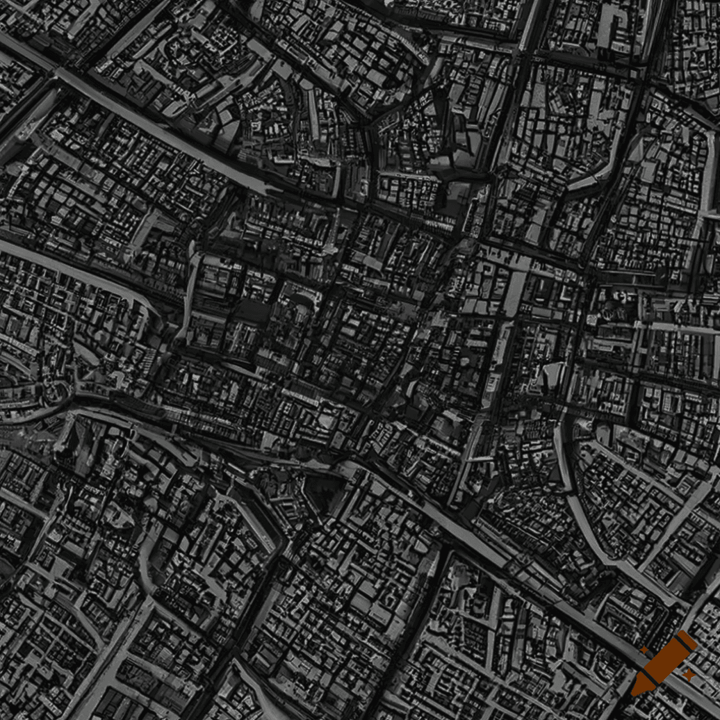
I worked on designing the Homebase screen and the Missions screen without the expedition feature (cut due to scope).

HARD
DIFFICULTY |
REWARDS |
+10
+20
MISSION. ASCENSION
blahblahgbakhabkahbkbakhbakhabakhbakhabkahbahkbahabkhhaba
HARD
DIFFICULTY |
REWARDS |
+10
+20


Let’s talk about anything and everything~ Find me at shimteri@gmail.com, linkedin.com/in/teri-shim, or x.com/documen_teri.
